

The primary purpose of this page is to show examples of good and bad lighting design. In addition, examples of gross over illumination will be shown. At the moment there are only a few images on this site (I need to get out and take more as time permits). This page will concentrate on examples of lighting in Wilbraham, MA (Wilbraham is a town of about 18,000 people just east of Springfield MA). The examples shown below are typical of many cities around the country. Check out my Light Pollution Page if you arrived here from other than that location!
Balise Ford (located at the intersection of Rt. 20 and Stony Hill Rd) has the dubious distinction of being the worst light pollution source in the entire town of Wilbraham. This car dealership is fairly new, having opened up for business only a few years ago. The lighting levels on this car lot are extreme... I counted over 70 individual lights on this lot! The image below shows only a portion of this dealership but nonetheless gives an example of the excessive amount of lighting in use. The houses in the area are bathed all night in permanent "twilight". On rainy nights the glare caused by excessive lighting on this lot can be a real hazard.
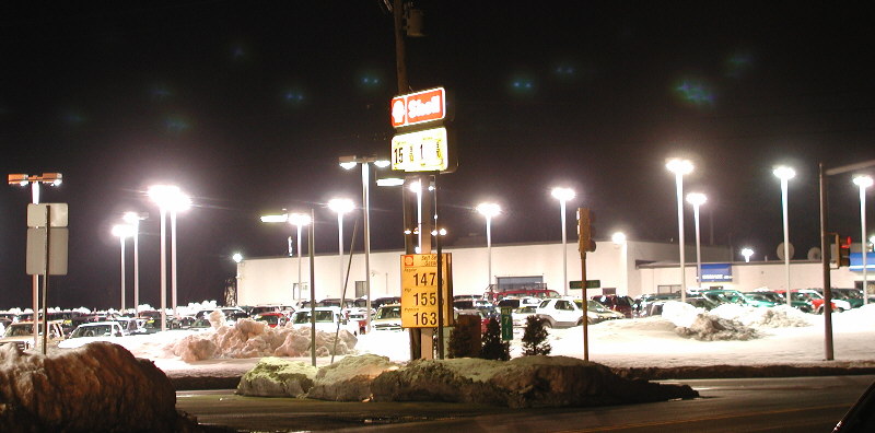
Granted, the lights on this lot are for the most part downward facing (a good thing), the problem here is the sheer number of and the intensity of the lights. I stopped counting at 70 individual lights... let's say they are on for an average of 8 hours per night. Also, let's estimate that they are 500W each. On this assumption, the total kWh burned per night is 70 x 0.5 x 8 = 280 kWh. This means that this lot burns more electricity on lighting alone in one night than my entire house uses for everything for an entire month! At $0.10 per kWh of electricity, this bill comes to $28 per night, or about $840 per month (Any clue as to who pays for this)??? Plus, these lights are on all night long, these are hours when the dealership is not even open! Balise Ford is not alone in having the distinction of being one of the worst offenders when it comes to light pollution; in general car dealerships are at the top of the list when it comes to this problem.
Roberts Mobil is located on Rt. 20 near the intersection of Main St. This is a newly reconstructed gas station (formerly Skorupski Bros.). This facility is lit to the extreme! The entire neighborhood is flooded with stray light. The level of illumination is substantially greater than that of the Sunoco Station which is adjacent to the Mobil station. Why is this place so grossly overlit? Wilbraham is a low crime area, so my guess is that the owners want people to "notice" it. Maybe this is some kind of strategy to get people to stop at Mobil for gas instead of Sunoco or Citgo. If the reasoning is for "safety", the level of light is far in excess of what is needed for safety. Pumping gas under this lit up canopy makes one feel more like they are on the set of a Hollywood movie! The gas at this station is more expensive than the other two stations located within a few hundred yards. No doubt there are higher electricity bills at Mobil. Any guesses as to where I don't purchase gasoline?
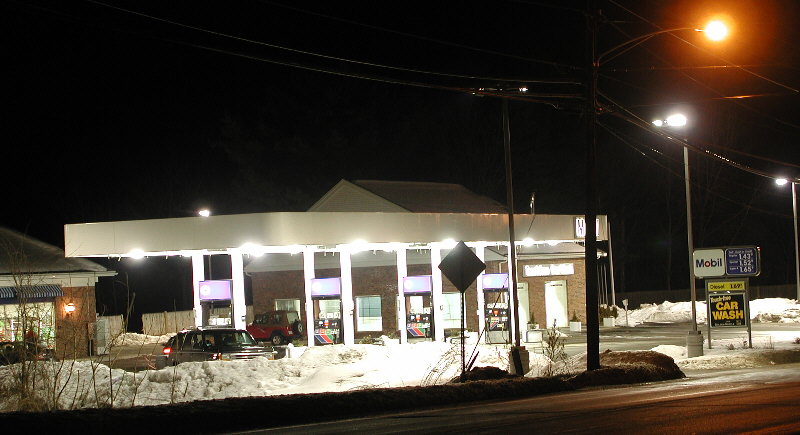
The image above does not show a number of pole mounted (sideways aimed) floodlights which also contribute to the bad situation...
The new Wilbraham Self Storage facility on Rt. 20 (at the site of the old State Line Potato Chip Factory) is another one of the worst examples of lighting design I have seen. I do not have a photo yet... however there are nearly a dozen pole mounted light fixtures (with two lights per pole) at this facility, and they are all aimed at a nearly horizontal angle. The strategy was (apparently) to light up as much area with as few lights as possible (translation: tons of light is spewed far beyond the property boundaries). There are several lighst that present a significant glare hazard for people traveling west on Rt. 20. On a rainy night, try coming around the corner (westbound) on Rt. 20 and you will be faced with a dazzling light right in your face.
The Dunkin Donuts store on Rt. 20 is another of the worst offenders when it comes to light pollution. This establishment is among the newest in the rapidly expanding business corridor along Rt. 20. No photo to show just yet, however this facility uses eight very powerful pole mounted floodlights lights to cover the roughly 1 acre lot. The lights are for the most part sideways aimed... another example of trying to light as much as possible with as little as possible. The result? Horrible light trespass on adjacent properties. And, like many businesses, the lights are on all night long (including hours when the place is not even open for business)! The lights of this facility light up trees on the NORTH side of Old Boston Road, trees which are across the railroad tracks and on the other side of Old Boston Road! Is this really necessary?
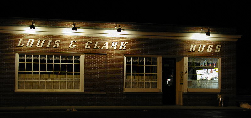
Below is a nighttime shot of the Louis and Clark drugstore at the center of town. Why is this an example of good lighting? (1) The lights are aimed DOWNWARD (not upward). This means that the vast majority of the light ends up on the item to be lighted, it does NOT end up in the sky! (2) The lighting levels are reasonable and adequate for public safety. (3) The lights are not aimed at the roadway where they might otherwise cause excessive glare for motorists. (4) The actual light bulbs are not directly visible (another important factor in reducing glare).
The daytime photo below further illustrates why Louis and Clark has good lighting. Notice that the lights are indeed aimed downward, and the actual bulbs are not visible unless you are directly underneath them. Although it is not obvious in these photos, Louis and Clark has made another smart step: the bulbs in the fixtures are high efficiency energy saving type lamps!
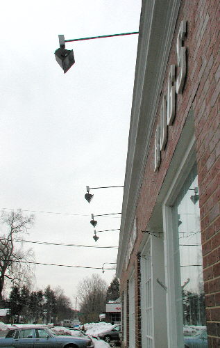
Thumbs UP for the lighting on Louis and Clark Drugs!
The sign for Sevey Park at Bruuer Pond is a superb example of proper lighting; see the photo panel below. Why is this a top notch design? (1) The lights are located at the top of the sign and they are aimed downward so the vast majority of the light ends up on the sign, not in the sky. (2) The lights are located physically close to the sign (helping to further minimize the amount of light spilled into adjacent areas). (3) The lights are situated such that the bulbs are not visible to motorists, eliminating the possibility of annoying and dangerous glare. Also, the sign is of a relatively dark color with lighter colored lettering; this too helps reduce the amount of light reflected into unwanted areas.
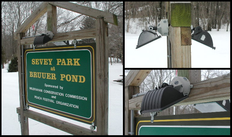
Congratulations to the designer of this lighting installation for an excellent job!
Use your browser's "back" button, or use links below if you arrived here via some other path:
This page is part of the site Amateur Astronomer's Notebook Light Pollution Page.
E-mail to Joe
Roberts
Images and HTML text © Copyright 2001 by Joe Roberts. Please request permission to use photos for purposes other than "personal use".